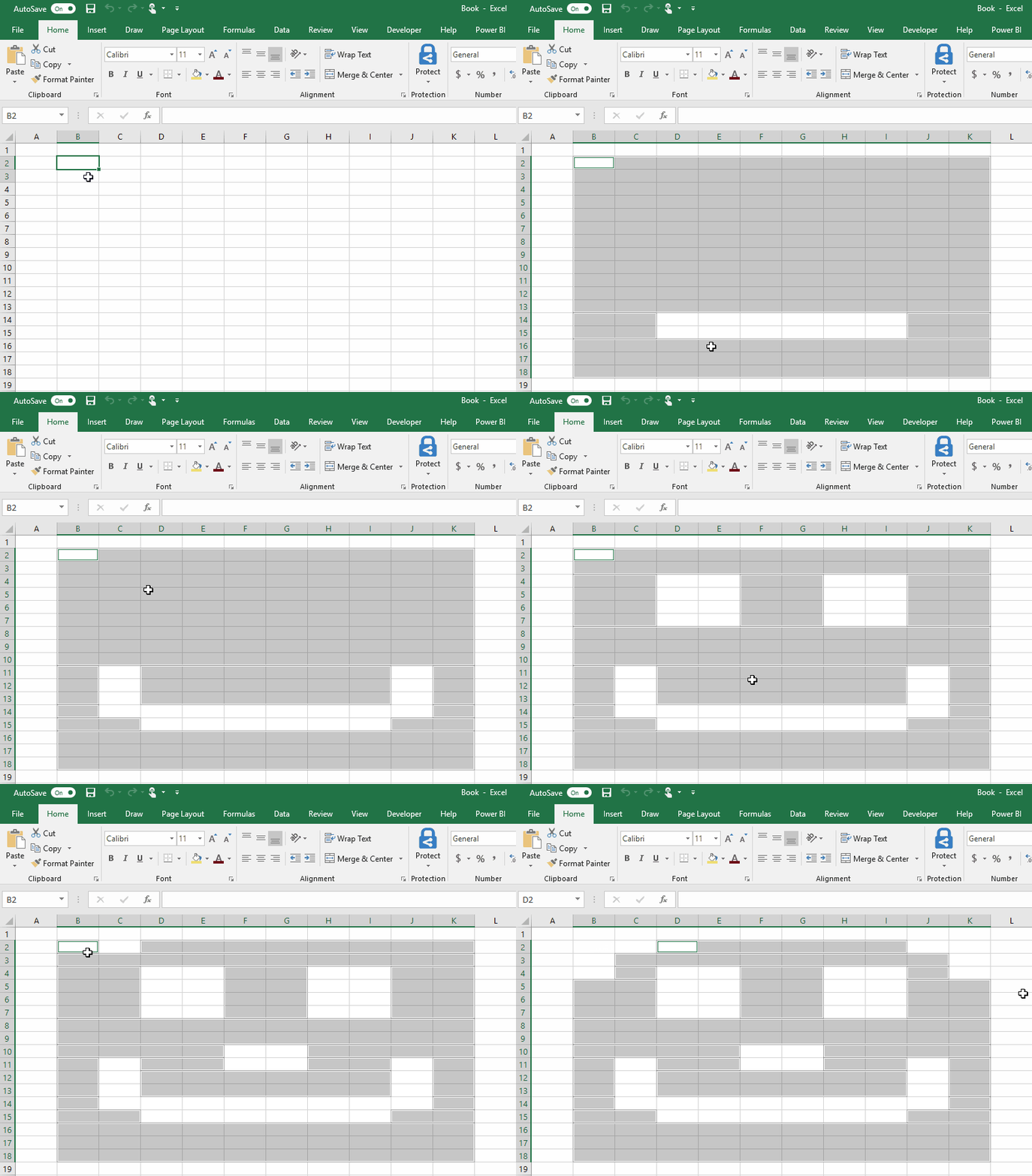
It can be hard to get a lot of meaning out of numbers in a worksheet. But Excel provides a bunch of ways to quickly analyze your data using conditional formatting. For example, you can use a color scale to differentiate high, medium, and low temperature values.


Here’s how you can quickly apply this type of formatting:
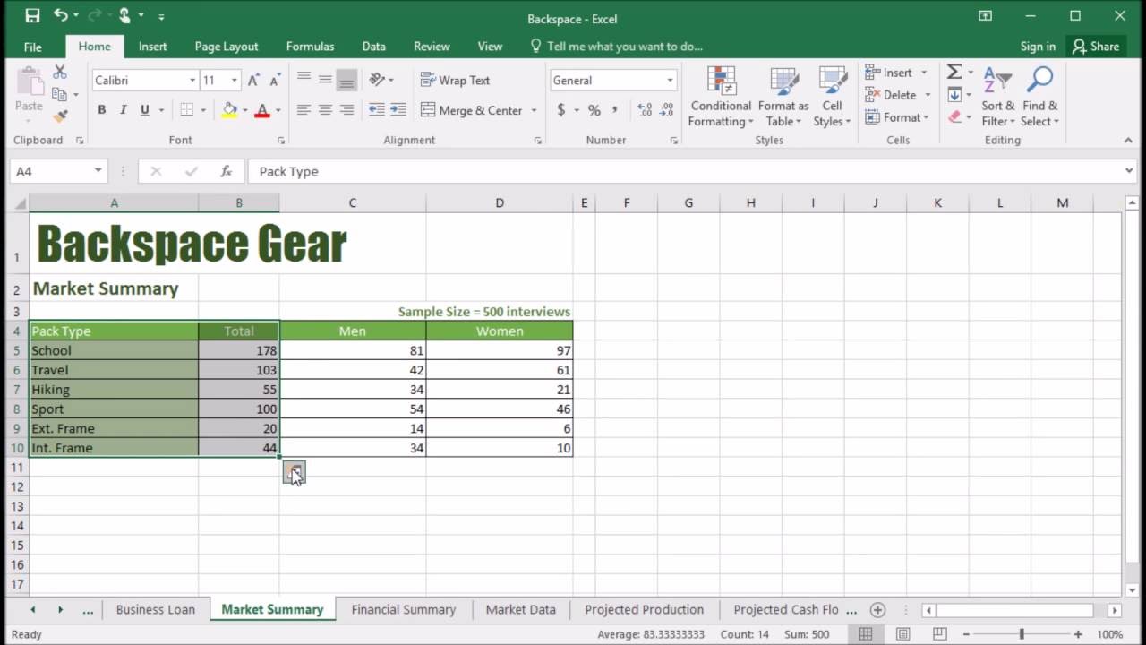
Start by selecting your data. The Quick Analysis button appears on the lower-right corner of the selection.
Click the Quick Analysis button , or press Ctrl+Q.
On the Formatting tab, move your mouse over the different options to see a Live Preview on your data, and then pick the formatting you like best.
Quick Analysis Button In Excel
Notes:
To remove any conditional formatting, click Clear Format in the Quick Analysis gallery.
For additional formatting options and colors, select your data, and then click Home > Conditional Formatting.
When you need to do a speedy analysis of your data in Excel 2016, consider using the Quick Analysis feature. Here are some points to keep in mind about Quick Analysis:
When you select a range of cells, a small icon appears in the lower right corner of the selected area. This is the Quick Analysis icon, and clicking it opens a panel containing shortcuts to several types of common activities related to data analysis.
Click on of the five headings to see the shortcuts available in that category. Then hover over one of the icons in that category to see the result previewed on your worksheet:
Formatting: These shortcuts point to conditional formatting options. For example, you could set up a range to make values under or over a certain amount appear in a different color or with a special icon adjacent.
Open the Quick Analysis panel by clicking its icon. Then choose a category heading and click an icon for a command.Charts: These shortcuts generate common types of charts based on the selected data.
Quick Analysis offers shortcuts for creating several common chart types.Totals: These shortcuts add the specified calculation to adjacent cells in the worksheet. For example, Sum adds a total row or column.
Notice that there are separate icons here for rows vs. columns.
Notice also that in this category there are more icons than can be displayed at once, so there are right and left arrows you can click to scroll through them.
You can use Quick Analysis to add summary rows or columns.Tables: You can convert the range to a table for greater ease of analysis. You can also generate several different types of PivotTables via the shortcuts here. A PivotTable is a special view of the data that summarizes it by adding various types of calculations to it.
The PivotTable icons aren’t well-differentiated, but you can point to one of the PivotTable icons to see a sample of how it will summarize the data in the selected range. If you choose one of the PivotTable views, it opens in its own separate sheet.
You can convert the range to a table or apply one of several PivotTable specifications.Sparklines:Sparklines are mini-charts placed in single cells. They can summarize the trend of the data in adjacent cells. They are most relevant when the data you want to trend appears from left to right in adjacent columns.
Choose Sparklines to add mini-charts that show overall trends.
Quick Analysis Tool In Excel For Mac
Excel for Mac Discover contextual tools You can display additional ribbon commands by selecting specific items in your workbook. For example, select a chart to reveal the Chart Design and Format ribbon tabs, or select a sparkline to reveal the Design tab. Insert functions, build formulas. Learn how to use AutoFill in Excel 2016, 2013, and 2010. Employ fill handle to auto-populate numbers, formulas, dates and other data. HI I'm trying to use the quick analysis tool but it is not appearing on the bottom right corner after selecting a table. Also i am not getting an autofill option. Apps for Excel for Mac. Excel's Quick Analysis button lets you instantly create different types of charts, including line and column charts, or add miniature graphs called sparklines. Select a range of cells. Select the Quick Analysis button that appears at the bottom right corner of the selected data.